How to Design and Print a Brochure
Learn how to design and print a professional brochure step by step. This hands-on guide uses a real museum project to show you how to plan, layout, export, and order your own brochure using free tools like Scribus.
Step by Step with a Real World Example
Designing and printing a brochure takes more than just dragging and dropping text onto a page. With multiple pages, folds, and layout options to manage, it’s one of the more complex print products — but also one of the most rewarding when done right.
But if you're ready to tackle it, this guide will walk you through the process step by step. We’ll use a real-world example: a brochure I designed for our local open-air museum here in North Karelia.
🎥 Prefer to watch? Jump to the video tutorials
Introduction: Start With the End in Mind
Whenever I design something for print, I try to begin at the end. Before I open any design software or start playing with images, I ask myself three questions:
- What is the purpose of this print product?
- Who is it for?
- Where will it be used or handed out?
These three things guide every decision that follows — from format and paper to colors, fonts, and layout.
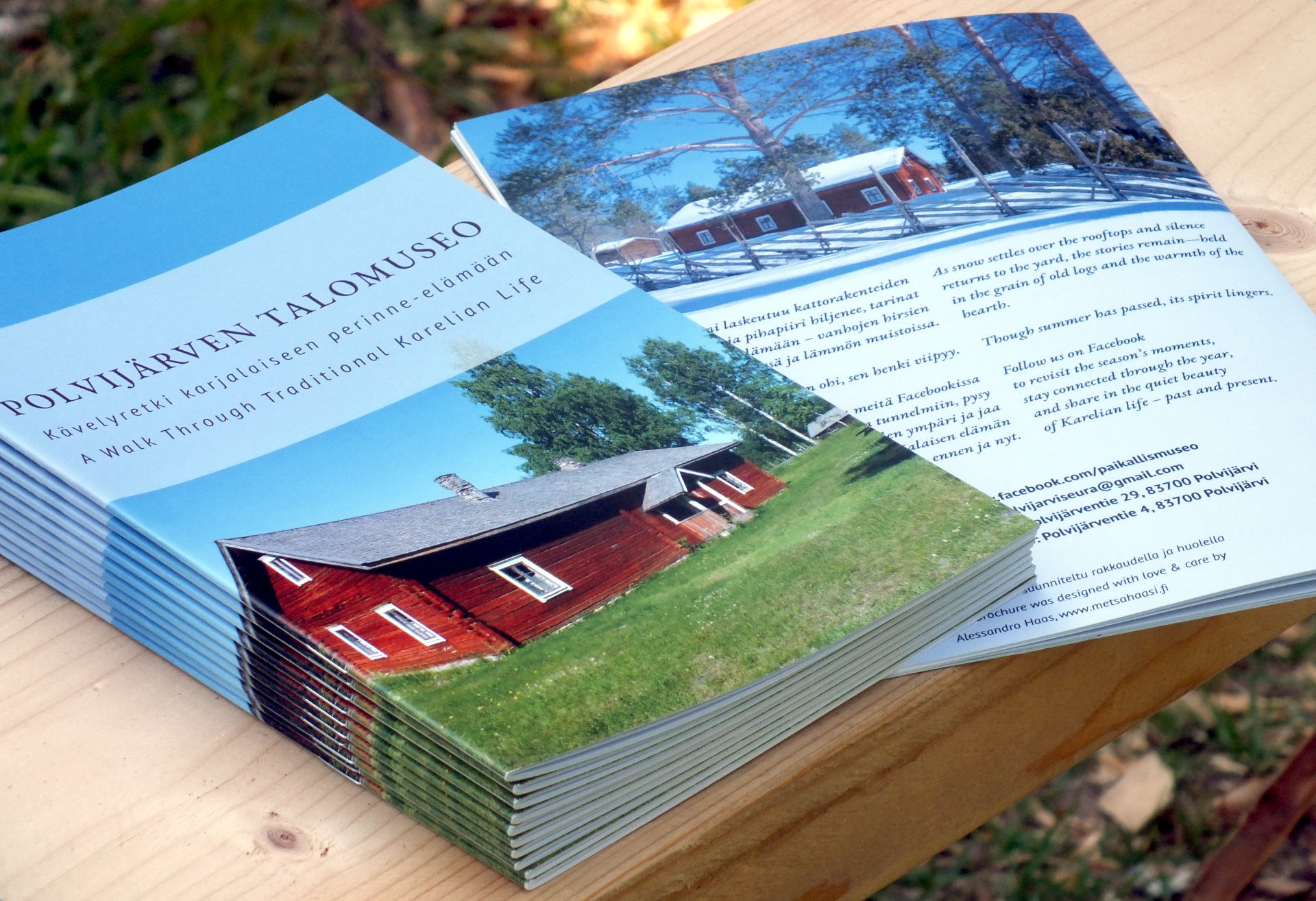
Take the brochure I made for the Talomuseo as an example. It was meant to be handed out during summer events at an open-air museum. That meant:
- People might be outdoors, standing, possibly in the sun or light rain.
- There was a lot of information to share, more than a flyer could hold.
- The budget was limited, but we still wanted it to feel valuable.
So I chose a simple A5 brochure with staple binding, printed on coated paper to withstand outdoor use. The size made it easy to tuck into a small bag or pocket. The coated surface made the photos look crisp, and using the same paper for both cover and pages helped keep costs down.
That’s the kind of thinking I always start with. Form follows function. This real-world context helped shape every decision — from format to finish — making sure the final brochure matched its purpose and felt right in hand.
Overview of the Brochure Design Process
Designing a brochure might sound like a creative task — and it is — but it’s also a surprisingly logical process. Once you follow a few clear steps, things begin to fall into place. Here’s how I usually do it:
1. Clarify the Purpose and Audience
Before anything else, I ask: What is this brochure supposed to do?
Is it meant to inform, to attract, to persuade? And who is it for — curious tourists, potential voters, future customers? Getting clear about the goal makes every other decision easier. It tells you how much text you need, how many pages it might require, what tone to use, and what kind of visuals will fit.
2. Choose the Right Format
This is where the function becomes form. A flyer is quick and cheap, but too limited for complex topics. A folded leaflet is better for short event info. A stitched brochure gives you more space, structure, and presence — especially when your audience will take it home and read it later.
For the Talomuseo project, I picked an A5 stapled brochure — small enough to carry, big enough to hold eleven spreads of content plus a cover and back. I also chose coated paper for durability, since it would be handed out during outdoor events.
What is a Spread?
In printing, a spread refers to two facing pages that appear side by side when a brochure, magazine, or book is opened flat. For example, when you open a brochure, the left and right pages together form one spread. Designers often treat these two pages as a single unit to create layouts that flow smoothly across the fold — like a background image or headline that spans both pages. Spreads are important when working on folded brochures or multi-page booklets, because the way pages pair together affects how your content is seen and read.
At this stage, it's important to contact your printing house about available options and prices for your project. They will also tell you exactly what requirements your print file needs to meet and they will make recommendations if you are unsure for example about the paper quality or binding style. With the print specifications in hand we can move on.
3. Prepare the Content
This step saves more time than any fancy design trick: write and edit your text before opening any design tool. I usually draft everything in a plain text or Markdown file. I make a rough outline, fill in the sections, and tighten the language until it feels clear and complete.
At the same time, I start selecting photos, illustrations, or graphics that support the message — ideally from real-life events or products, not stock images. The content drives the layout — not the other way around.
4. Define the Visual Tone
Once I have the text and images ready, I begin shaping the visual identity:
- I choose a main photo for the cover — something that captures the emotion or spirit of the project.
- I extract a color palette from that image using tools like Adobe Color.
- Then I pick two fonts that match the mood and fit the context (formal, friendly, playful, historical, etc.).
If you’re curious about that part, I recommend reading our articles on fonts, colors and papers. It makes a big difference — but it only works if you’ve done the earlier steps first.
5. Choose the Right Tool
This is where many people get stuck — but don’t worry. You only need one basic tool to create a professional-quality brochure:
- Scribus — free, open-source layout software for full control. I focus on Scribus in my guides because it gives you professional-grade control without the cost.
- For many other print products you can use an Online Design Tool from a printshop like print24.fi for simple drag-and-drop design but unfortunately creating a brochure is currently still outside the capabilities of this tool. That means we will use Scribus to create the print file.
- For image editing, I often use GIMP and Krita — two free tools that help me adjust colors and prepare images for print. You don’t need them for every project, but they’re good to have in your toolkit.
If you already own Adobe InDesign or Affinity Publisher, you probably don’t need this guide — but if you're working with zero budget or want to learn how it really works, you're in the right place.
6. Put it all together and design your brochure
Use your preferred tool to put it all together. If you have followed the steps, you should already know the format, fonts and colors you are going to use. Because you will have to set up your document in your layout software accordingly before you put any text or image on paper. I also assume that you have received the print file requirements from your printing house. These will tell you exactly how to set up your document with bleed and what color profile to use when you export your final print file.
What is Bleed?
Bleed is the extra margin of color or image that extends beyond the edge of the final printed size. It ensures that when the paper is trimmed after printing, there won’t be any unexpected white edges — even if the cut is slightly off. Most printers require a bleed of 2–3 mm on each side. So if you are designing a DIN A4 page (210 × 297 mm), you should make your design 216 × 303 mm with bleed included. Always extend background colors, photos, or full-width elements into the bleed area.
I would recommend that we move over to the how to video where I show exactly this process with Scribus. That will make it more clear. But do keep the whole process in mind. Scroll a little down to start the video!
7. Export and Upload the Print File
Once your layout is done, it’s time to export the PDF — with the right bleed, resolution, and color profile for your printshop. I’ll walk you through those settings step by step in my video. Then you simply upload it, double-check the preview, and place the order.
This step depends on the requirements that your printing house provided to you in Step 2. You should have a specification sheet where you can look up the color profile and recommended pdf version. If you do not have exact specifications, here is a safe default setting to get you started:
Recommended Default Export Settings for Print
If your printer doesn’t provide specifications, export your file as a PDF/X-3:2002. If your software supports it, PDF/X-4 is also acceptable and allows for transparency. Use CMYK color mode, outline or embed all fonts, add a 3 mm bleed. Do not include crop marks unless specifically requested. Use a reliable ICC profile like ISO Coated v2 (ECI) for coated paper, or PSO Uncoated v3 (ECI) for uncoated paper. All raster images should be at least 300 dpi in their final size. This ensures print compatibility across most platforms.
🎬 Video Tutorials
Prefer to watch the process? These videos walk you through the full brochure creation from layout to paper choice. You’ll see exactly how I designed the Talomuseo brochure using free tools.
COMING SOON
I am working on it!
Scribus Step-by-Step Tutorial
Watch how I set up the layout, add content, and export the print-ready file in Scribus.
Audio in English.
Finnish subtitles available.
COMING SOON
I am working on it!
Brochure Showcase & Paper Choice
Take a look at the final brochure and learn about the paper, binding, and tactile choices that bring it to life.
Audio in English.
Finnish subtitles available.
Got stuck along the way? Reach out!
Designing a brochure isn’t always smooth sailing — sometimes margins jump around or PDFs refuse to behave. If you followed the guide and hit a wall, don’t worry. I’m a real human (not a bot), and I’m happy to help. Just shoot me an email at alessandro@painomestari.fi and tell me where things went sideways. Let’s get your project back on track.
Current Print24 / Infowerk Discount Codes:
Since you’re here at Painomestari, diving into the world of better print design, here’s a little something to say thanks. Use these discount codes to save 5% on your next print project. When you have your print file ready, go with the print24 professional shop. When you want an easy way to design your print product, choose the Infowerk online design tool. Just enter those codes in the coupon field during checkout! You're welcome!
Print24 Professional Shop Code
Copy & use this code to get 5% off your first order.
Infowerk Online Designer Code
Copy & use this code to get 5% off your first order.
PS: Want 10% off? Join the Print Circle for free — the exclusive codes are just for subscribers.